Configuring Jekyll, R Markdown and GitLab Pages
I’ve been experimenting with pushing R Markdown documents to my Jekyll GitLab Pages site. Steven Miller has written a great blog post about this, from which I’ve grabbed some YAML and R code.
The key is to write your post as an .Rmd saved in a suitably named
non-_posts folder (I’ve named mine _source). Then you can knit an
md_document into the Jekyll _posts directory via the following
snippet in the YAML header. Just remember to set preserve_yaml: TRUE:
output:
  md_document:
    preserve_yaml: TRUE
knit: (function(inputFile, encoding) {
  rmarkdown::render(inputFile, encoding = encoding, output_dir = "../_posts") })
If you also want the R Markdown figure assets saved in a different
folder (and you should!), you can do that in the setup chunk, like so.
My fig_path is an assets folder that I’ll need to restructure at
some point. I typically set echo = T in R Markdown, but like to
suppress messages and warnings once I’ve run each chunk to verify that
it works correctly.
knitr::opts_chunk$set(fig.path = fig_path,
                      cache.path = '../cache/',
                      echo = T, message = F, warning = F, cache = T)
I haven’t yet automated the production of a Markdown file from the
source .Rmd file with GitLab CI/CD, which means I have to knit the
.Rmd myself on my local machine. But that doesn’t take so long.
To demonstrate the approach, here’s a graph depicting Apple Maps
mobility data, which I’ve sourced from Kieran Healy’s excellent
covdata package.
# remotes::install_github("kjhealy/covdata", force = T)
library(covdata)
library(tidyverse)

apple_mobility_ends <- apple_mobility %>%
  filter(region == "Ottawa") %>%
  group_by(transportation_type) %>%
  filter(date == max(date)) %>%
  pull(score) %>%
  round(., 1)

apple_mobility %>%
  filter(region == "Ottawa") %>%
  ggplot() +
  geom_line(aes(date, score,
                group = transportation_type, colour = transportation_type),
            size = 1) +
  scale_x_date(date_break = "1 month", date_labels = "%B %e",
               expand = c(0, 0)) +
  scale_y_continuous(sec.axis = sec_axis(~., breaks = apple_mobility_ends)) +
  scale_colour_brewer(name = "Transportation type", palette = "Set2") +
  cowplot::theme_minimal_grid(14) +
  theme(legend.position = "bottom") +
  labs(x = "Date",
       y = "Relative index",
       title = "How have Ottawa's transportation levels changed in 2020?",
       caption = "Source: Apple Maps mobility data")
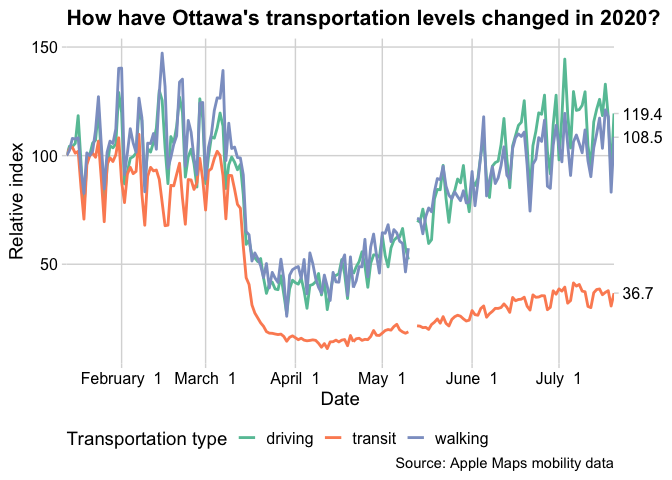
Transit usage has declined most significantly of the three
transportation modes captured in Apple’s data, and it’s been the slowest
to recover. More interesting to me is the fact that the recovery
plateaued in early July at less than 40 percent of typical pre-pandemic
ridership (or rather Ottawa ridership by Apple users). This is
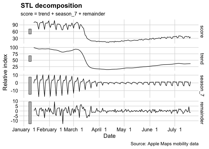
especially clear when we look at a simple STL decomposition of the
transit time series. There were two days in May with missing data;
originally I carried over the previous non-null index with
tidyr::fill, which would have messed with the seasonality a bit. A
more sophisticated method uses Rob Hyndman’s
na.interp
function:
library(forecast)
library(fable)
library(feasts)
library(tsibble)

apple_mobility %>%
  filter(region == "Ottawa") %>%
  filter(transportation_type == "transit") %>%
  mutate(score = forecast::na.interp(score)) %>%
  as_tsibble() %>%
  model(STL(score ~ season(period = 7))) %>%
  components(.) %>%
  autoplot() +
  scale_x_date(date_break = "1 month", date_labels = "%B %e") +
  cowplot::theme_minimal_grid(14) +
  labs(x = "Date",
       y = "Relative index",
       caption = "Source: Apple Maps mobility data")
This seems like an ideal jumping-off point for a future blog post—stay tuned.